RepoScan: Track the flow of sensitive user data in codebase
80%
Onboarding completion rate
3x
Faster Time to first scan
8,000+
Sensitive data flow Issues detected
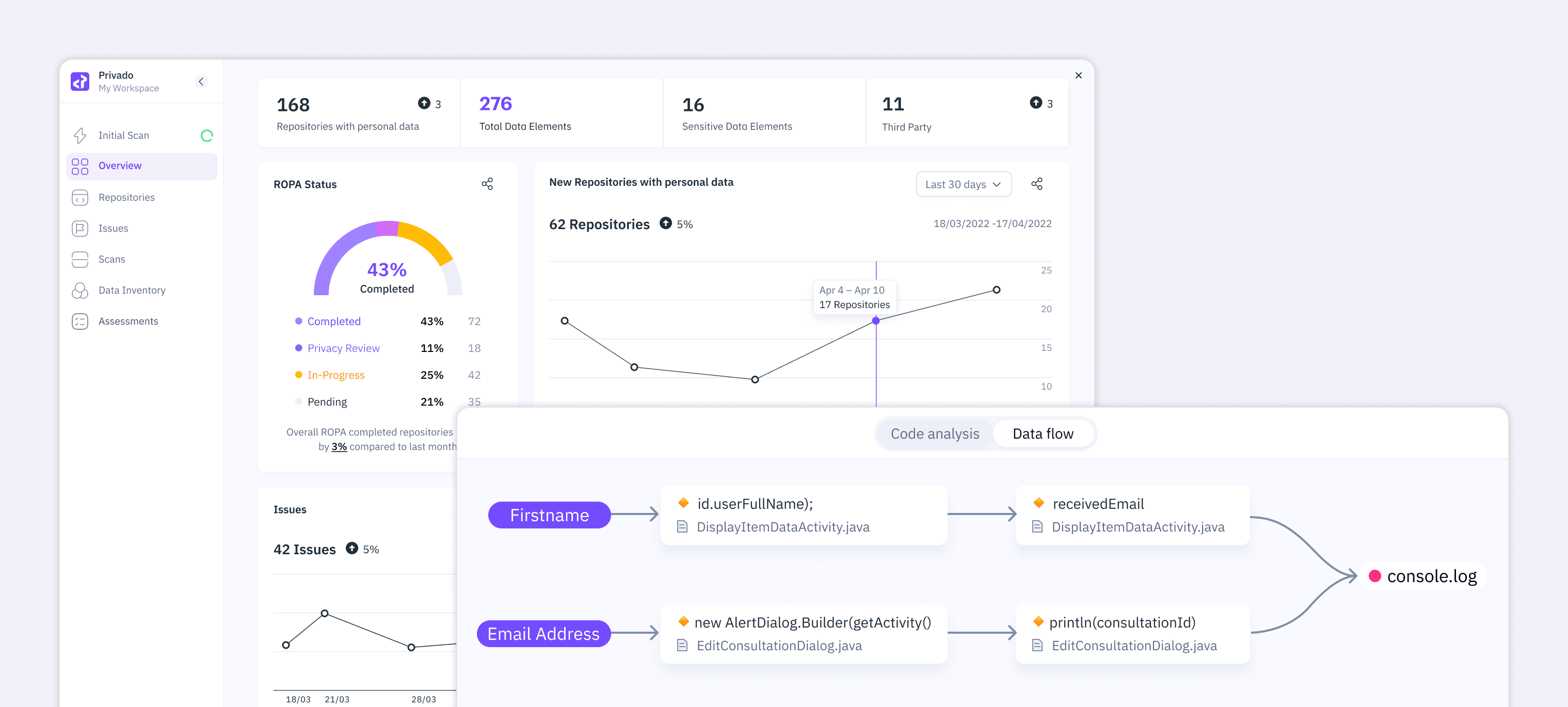
Products
Privado Web App
Team
Product Designer 2 (Me)
Head of Design
Product Lead
Software Engineer
My Role
Design for Onboarding and Issues: research, IA, interaction design, visual design, design systems.
About Privado
Privado is a code-scanning platform that helps organizations discover how personal data moves through their codebase. Unlike legacy tools built for privacy teams, Privado operates at the code level by scanning repositories to surface real data flows and compliance violations.
Product
Privado's web app lets privacy and engineering teams scan codebases, visualize data flows from source to sink, identify issues like log leakage and track remediation. The platform serves two personas with very different mental models: compliance managers who need regulatory oversight and developers who need forensic code-level evidence.
Business Requirements & Constraints
BUSINESS OBJECTIVES
Make privacy compliance actionable at the code level
Reduce onboarding friction for self-serve adoption
Design a shared workspace for both personas
Integrate into existing developer ecosystems (GitHub, Jira, Slack, CI/CD)
CHALLENGES
Privado faced three friction points stalling adoption.
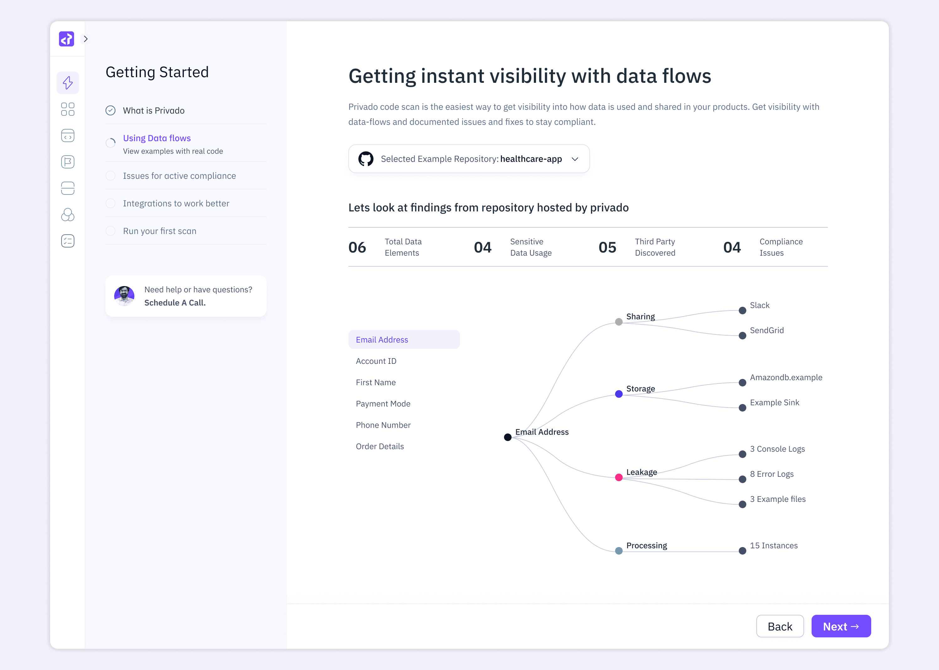
The language gap. Compliance teams and developers spoke different languages. Managers needed to see where data flowed; engineers needed code-level insights.
Zero live visibility. Teams were unaware of sensitive elements like Account ID or Payment Mode leaking into console logs until too late.
Non-actionable issues. Compliance issues were abstract and disconnected from the developer's environment. Engineers were told what was wrong but never where or how to fix it.
Research
Together with the PM I ran 9 user interviews: 5 compliance managers from mid-market SaaS companies and 4 backend engineers using competing privacy scanners. Sessions covered current workflows, friction points and the vocabulary each team used.
Three insights shaped every later decision.
"I don't even know what the issue means." Engineers dismissed compliance alerts as noise because findings lacked code context.
"I flag it but I can't fix it." Managers ran the tool but needed a developer to act, creating a handoff gap that killed momentum.
"I trust scanners that show me the line." Engineers trusted findings tied to specific files and line numbers, not policy categories.
I framed this as Jobs-to-be-Done: managers hire the tool to report risk; developers hire it to kill a bug. The product had to do both without forcing either persona into the other's workflow.
UX Strategy
The project began with a reframe: code as the source of truth. Instead of a dashboard engineers would ignore, I anchored the experience around data flows extracted directly from the repository. Every finding traced back to a specific line in a specific file.
three design pillars
Transparency over abstraction
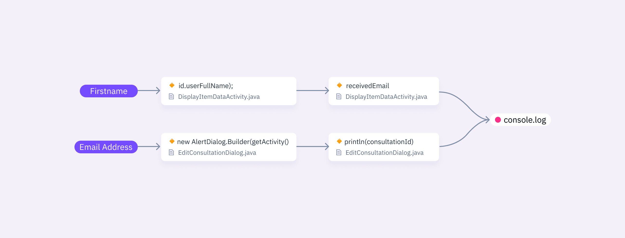
I designed the system to show the real journey of personal data through the code. You can see where a name likeuserFullNameis first written, every file it passes through and where it finally lands, such as a console log.Actionability over awareness
I made sure every issue arrives with a fix attached, not just a flag. Tiered remediation steps based on standard security practices and clearly pointing out the exact file where the problem lives.Progressive disclosure.
I built the interface so a compliance manager can glance at ROPA statusand a developer can trace a 12-step leak on the same screen. Each layer only opens when asked for.
Explorations
Before the data flow view landed, I explored three directions: a tabular issue-first list, a Sankey diagram and a node-graph showing categorical relationships.
The tabular approach failed in testing because managers couldn't extract a narrative. The Sankey implied data volume we couldn't accurately measure. The node-graph won because the story read instantly: "Email Address is leaking to Console Logs."
Visual Identity & Design System
Privado needed a visual language credible to engineers used to IDEs but approachable for managers living in spreadsheets. The system had to serve both worlds without defaulting to the cold aesthetic typical of security tooling.
COLOUR STRATEGY
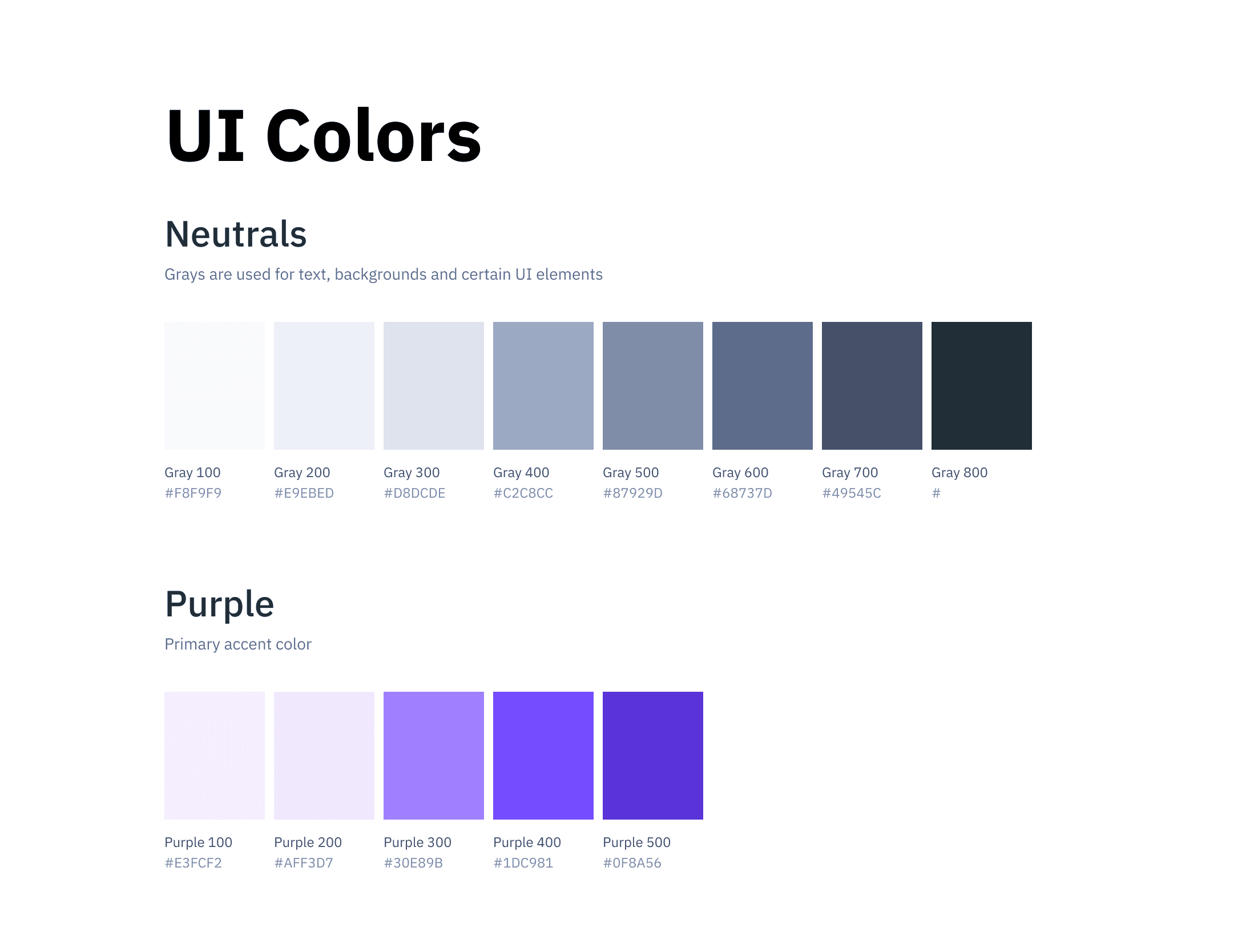
A restrained palette of soft blues, whites and neutral grays, stepping away from dark UI conventions. Colour is reserved for meaning: purple for primary actions, yellow and red for risk, green for success. When it appears it communicates something.
TYPOGRAPHY & INFORMATION DENSITY
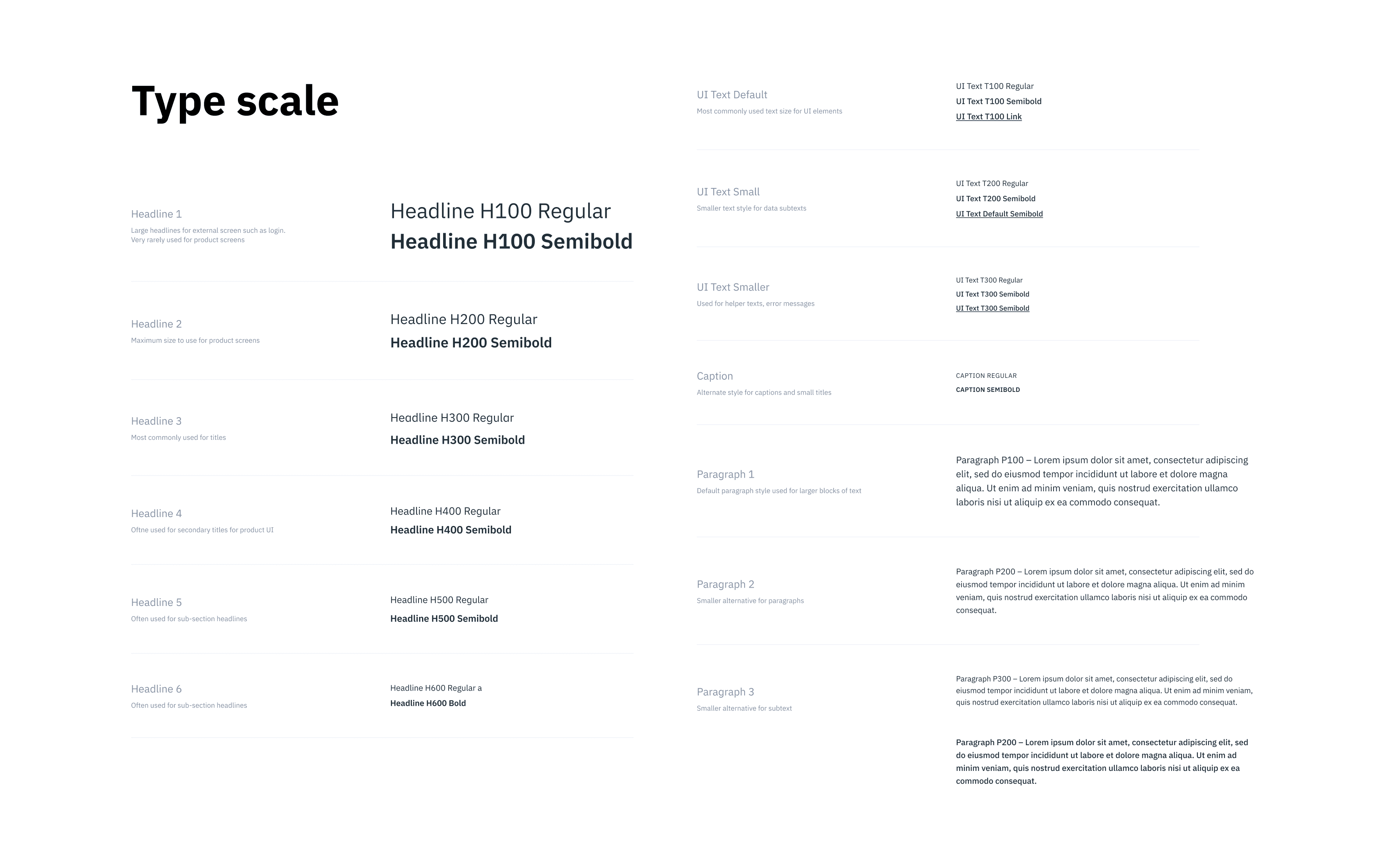
Given the volume of on-screen data, hierarchy carries the load. Large numeric KPIs create entry points for the eye. Issue rows use a consistent type scale where title, metadata and tags each occupy a distinct visual tier, enabling vertical scanning. Code views use monospace with a warm highlight band on the flagged line, borrowed from diff-view conventions developers already recognise.
COMPONENT CONSISTENCY
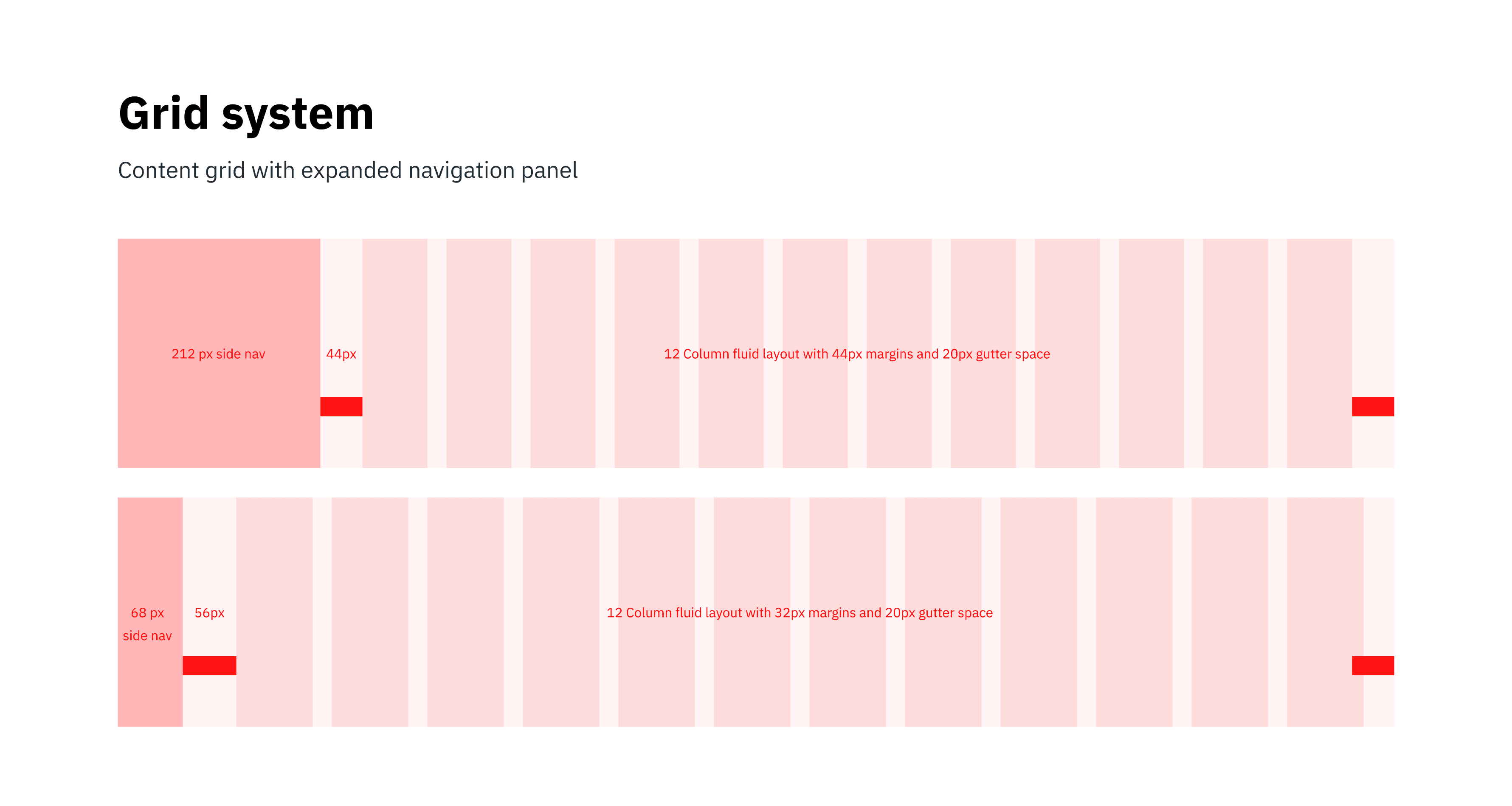
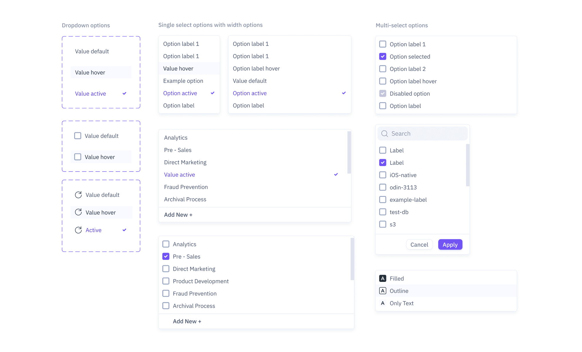
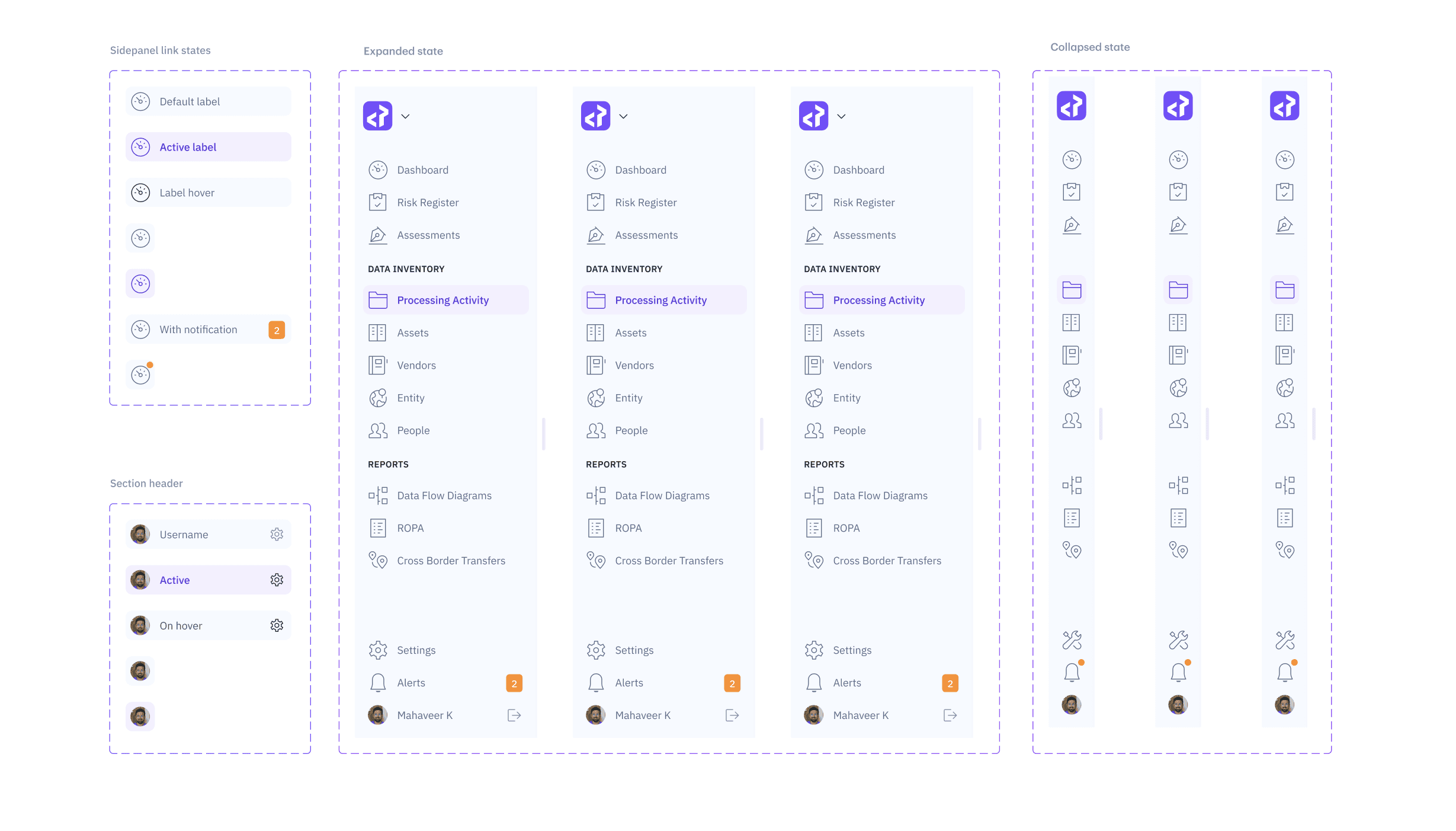
I built a library covering issue cards, filter chips, risk badges, sidebar states and action footers. The persistent footer appears wherever a decision point exists. The sidebar uses a vertical icon rail with expandable labels so navigation feels like the same product evolving from onboarding to dashboard, not a different one appearing.
The Onboarding Flow
Privacy tools usually demand heavy integration before showing any value. That kills adoption. I needed users to see their repo's privacy posture inside the first few minutes.
THE GUIDED WALKTHROUGH
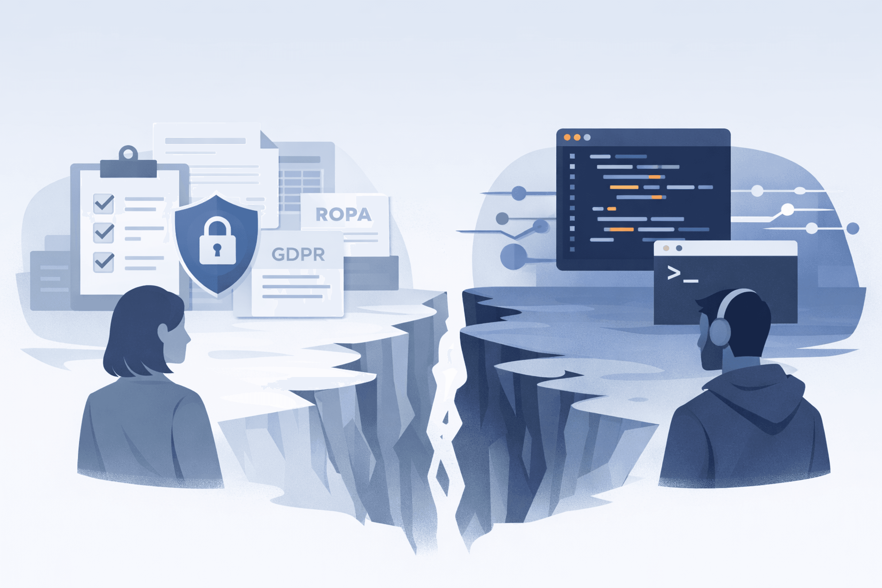
I designed a five-step onboarding using a pre-scanned example repo (healthcare-app), so users see real findings before connecting anything.
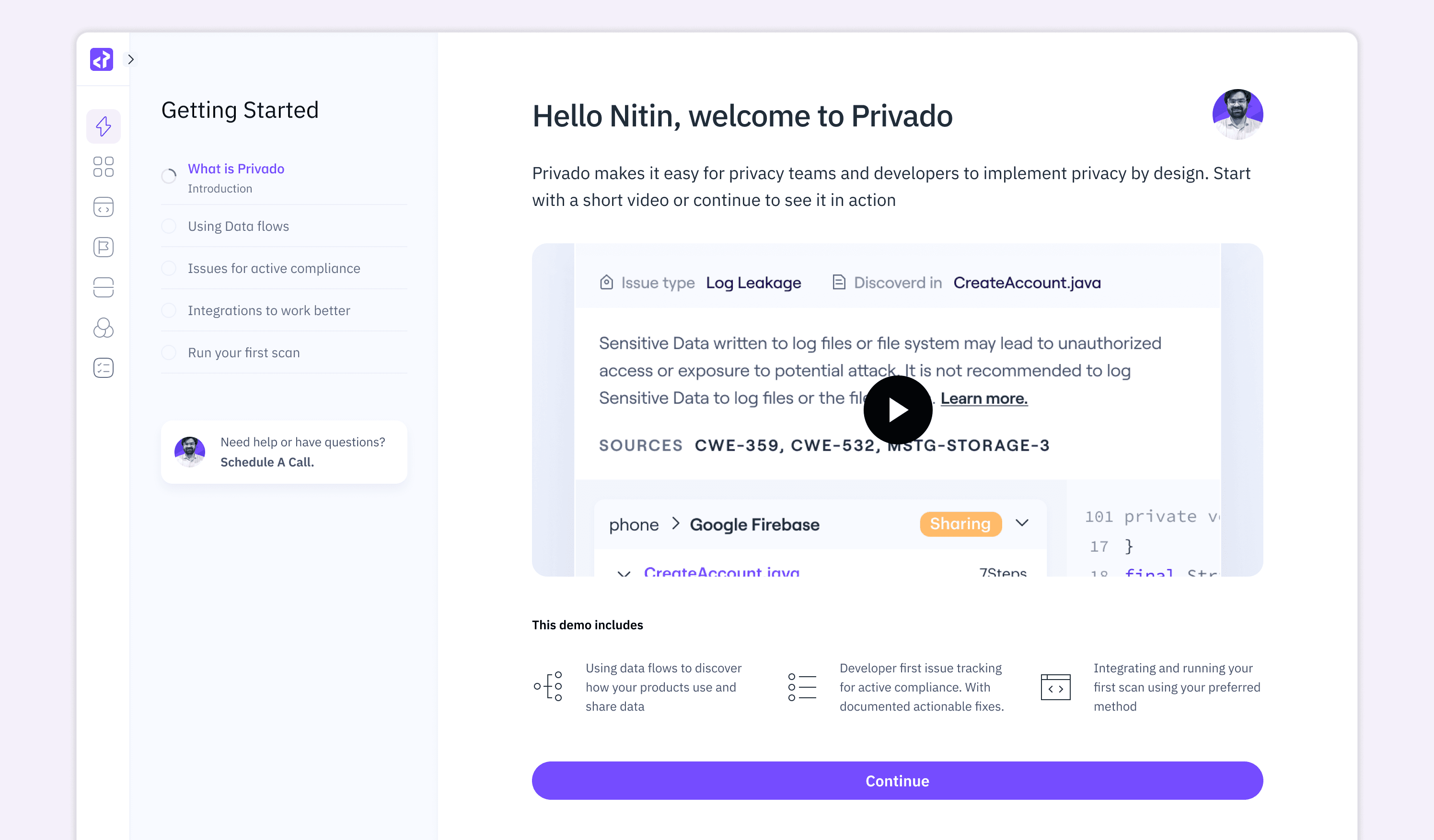
The left sidebar tracks progress. Each step builds on the last, from what Privado does, to data flows, to real issues, to integrations. It reads as a story, not a feature dump.
MULTIPLE ENTRY POINTS FOR FIRST SCAN
The final step is where users either convert or drop off. Different users have different tolerance for integration, so I designed three tiers:
CI/CD pipeline for teams ready to embed privacy into deployment
GitHub connection for continuous scanning with a one-time setup
CLI scan for trying it locally before committing to anything
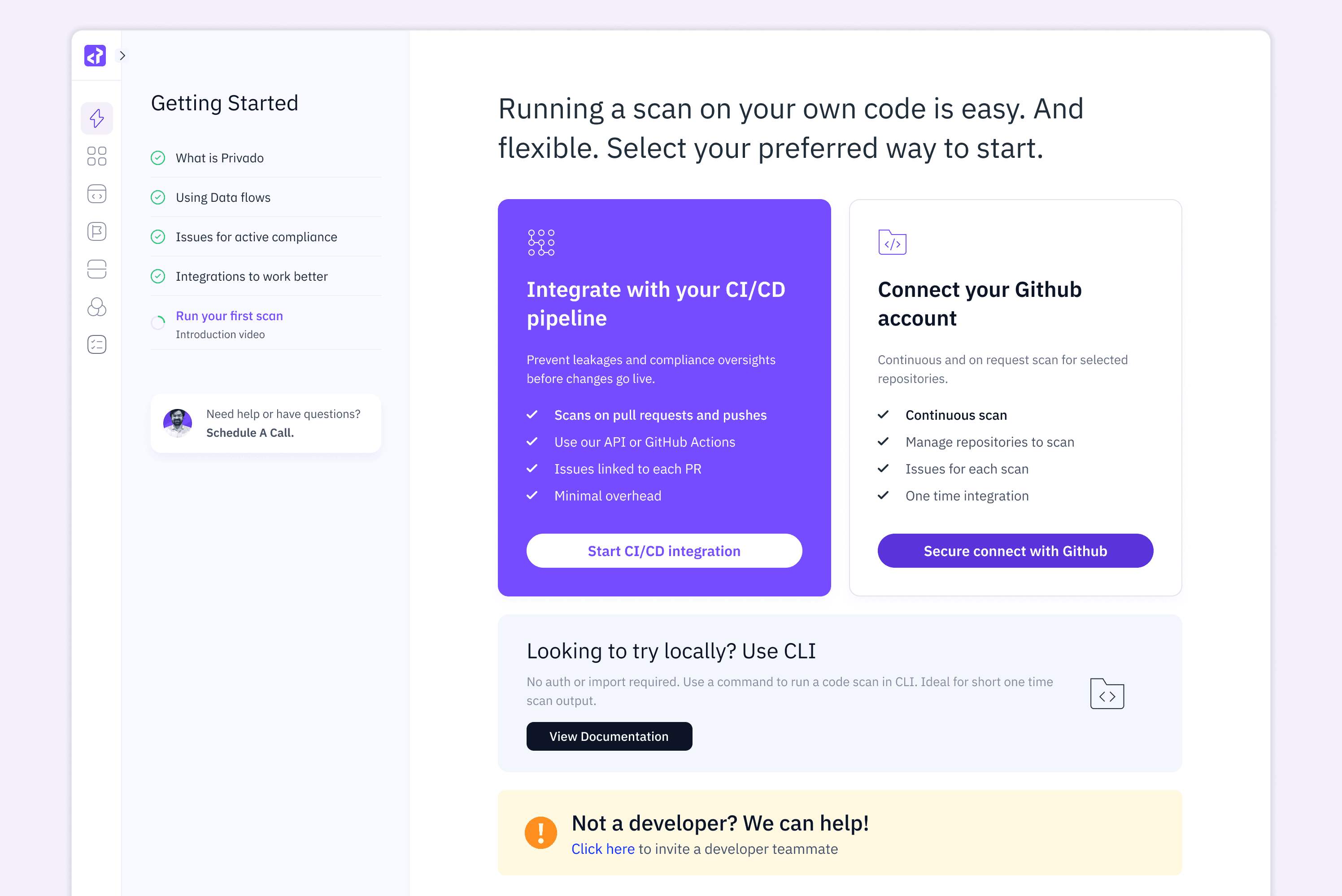
I added the "Not a developer?" banner on purpose. Compliance managers often start the evaluation but can't run scans themselves. The link lets them invite a developer teammate directly, closing a handoff gap that kills adoption in dual-persona tools.
Data Flow Visualization
Step 2 held the core IA challenge: how to serve a manager who wants risk at a glance and an engineer who wants code-level proof. I solved it with progressive disclosure that moves from big picture to smoking gun.
THE EXECUTIVE LAYER
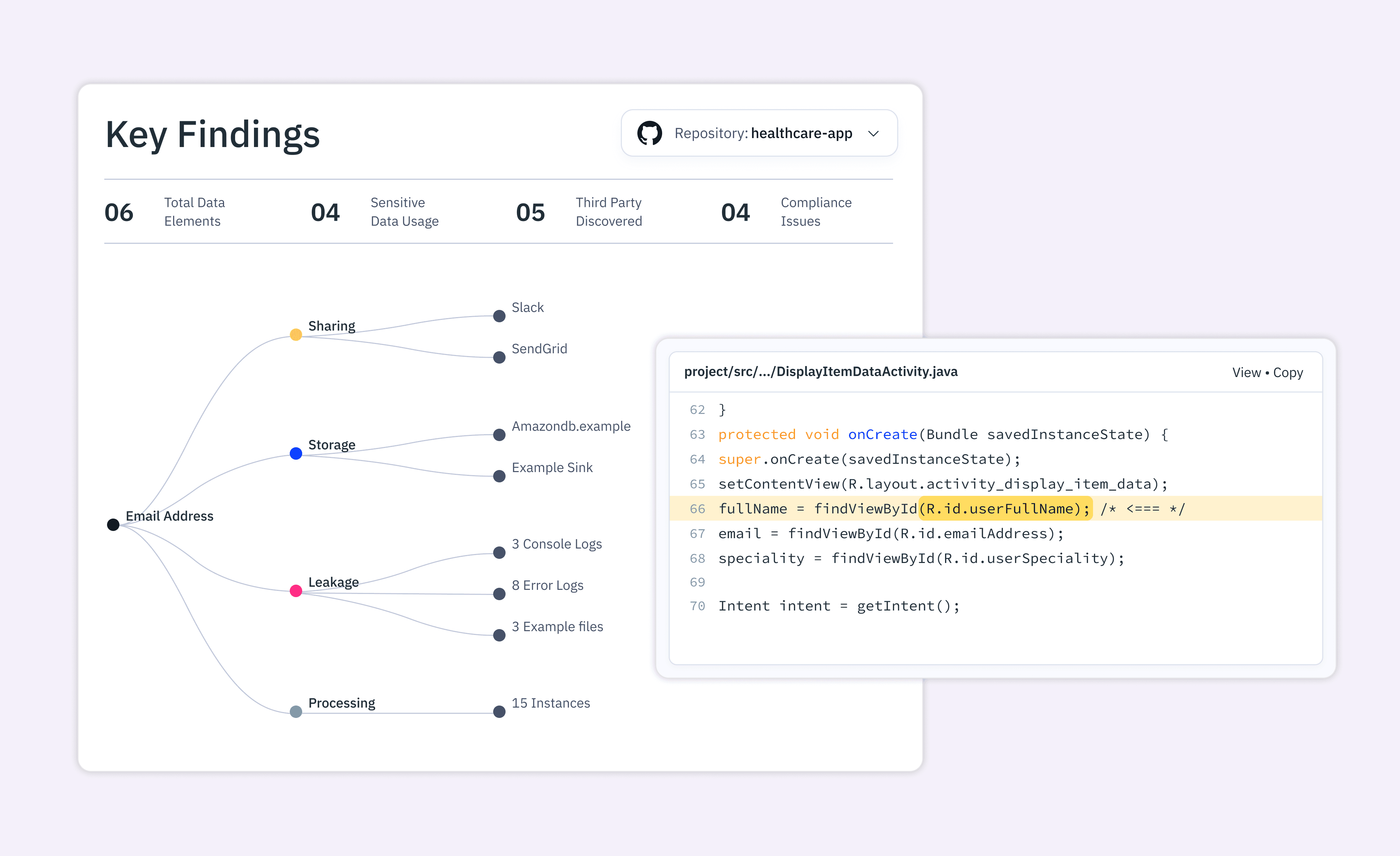
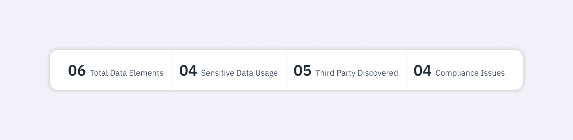
Four KPI cards sit at the top: Total Data Elements, Sensitive Data Usage, Third Party Discovered, Compliance Issues. A manager can read project health in under three seconds.
THE RELATIONSHIP MAP
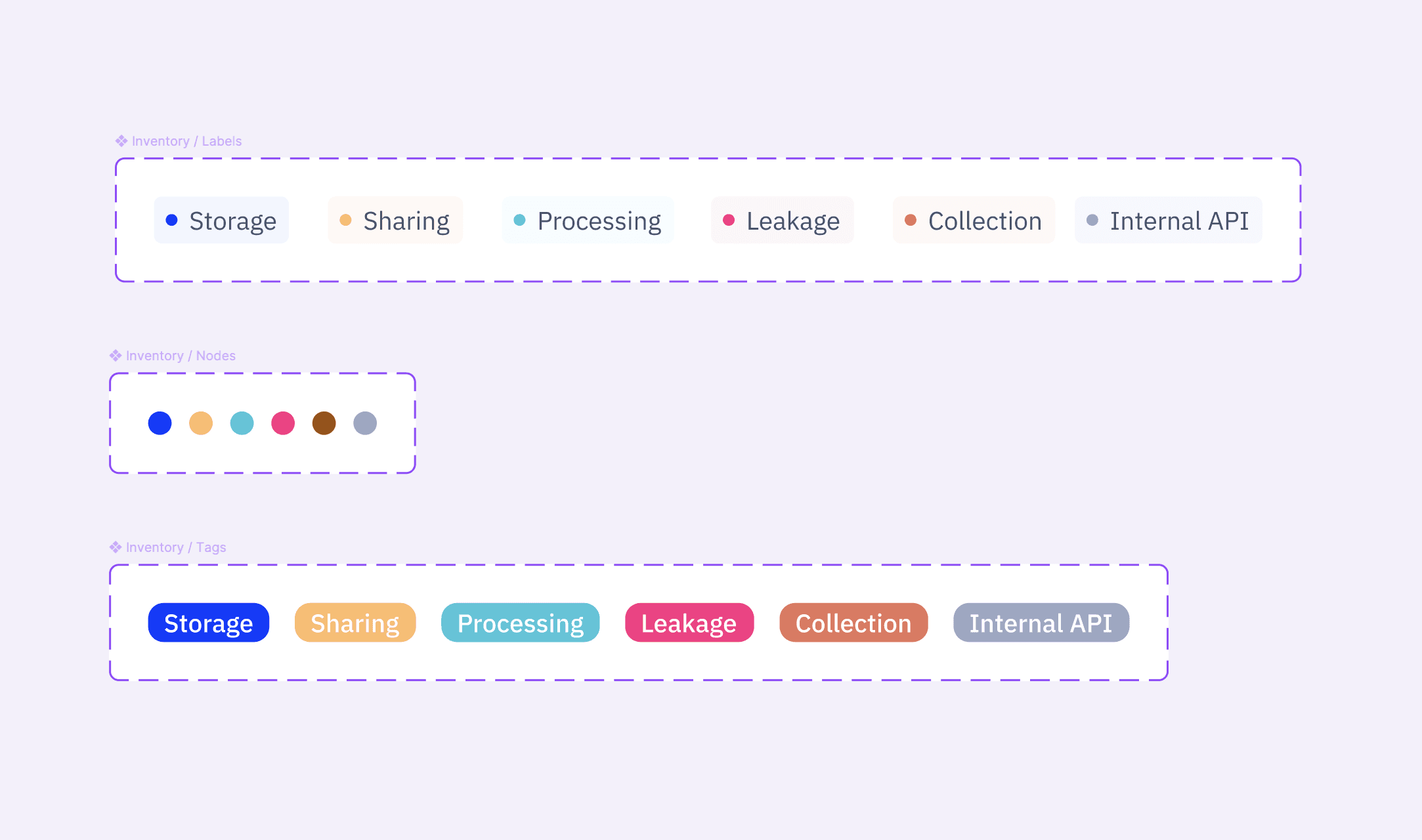
Below the KPIs, I mapped data elements to their destinations. On the left: data types like Email Address, Account ID, Payment Mode. These connect to grouped sinks, Sharing (Slack, SendGrid), Storage (Amazon DB), Leakage (Console Logs) and Processing.
The story reads instantly: "My users' Payment Mode is ending up in Console Logs."
THE EVIDENCE LAYER
At the sink endpoints I show instance counts: "8 Error Logs," "3 Console Logs," "15 Instances." These prove the finding is a systemic pattern, not a one-off, which is what engineers need to trust the scan.
Issue Detail & Code Analysis
The issue views had to earn developer trust. If it felt like compliance fluff, engineers would dismiss the whole tool.
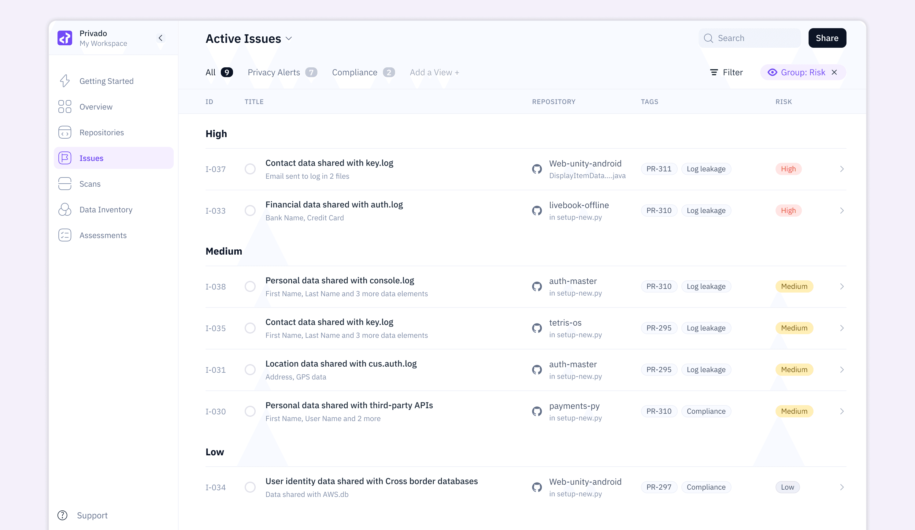
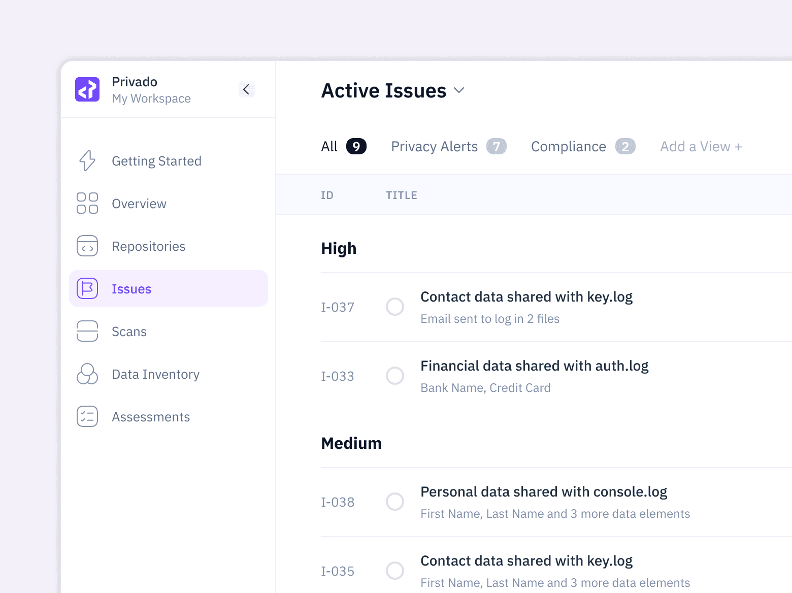
ISSUES LIST
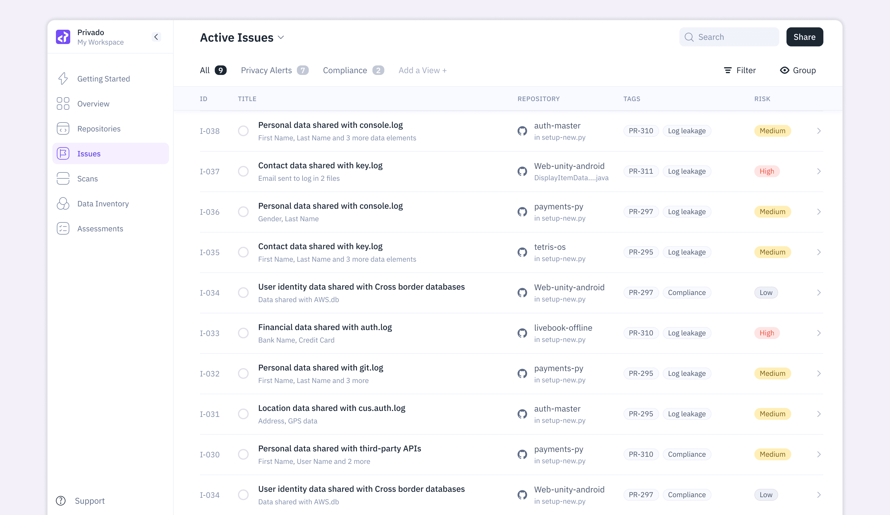
I designed each issue card to surface everything at a glance: ID, title, data elements, repo, file, PR number, type tag and risk badge. Nothing needs a click to assess priority.
ISSUE DETAIL
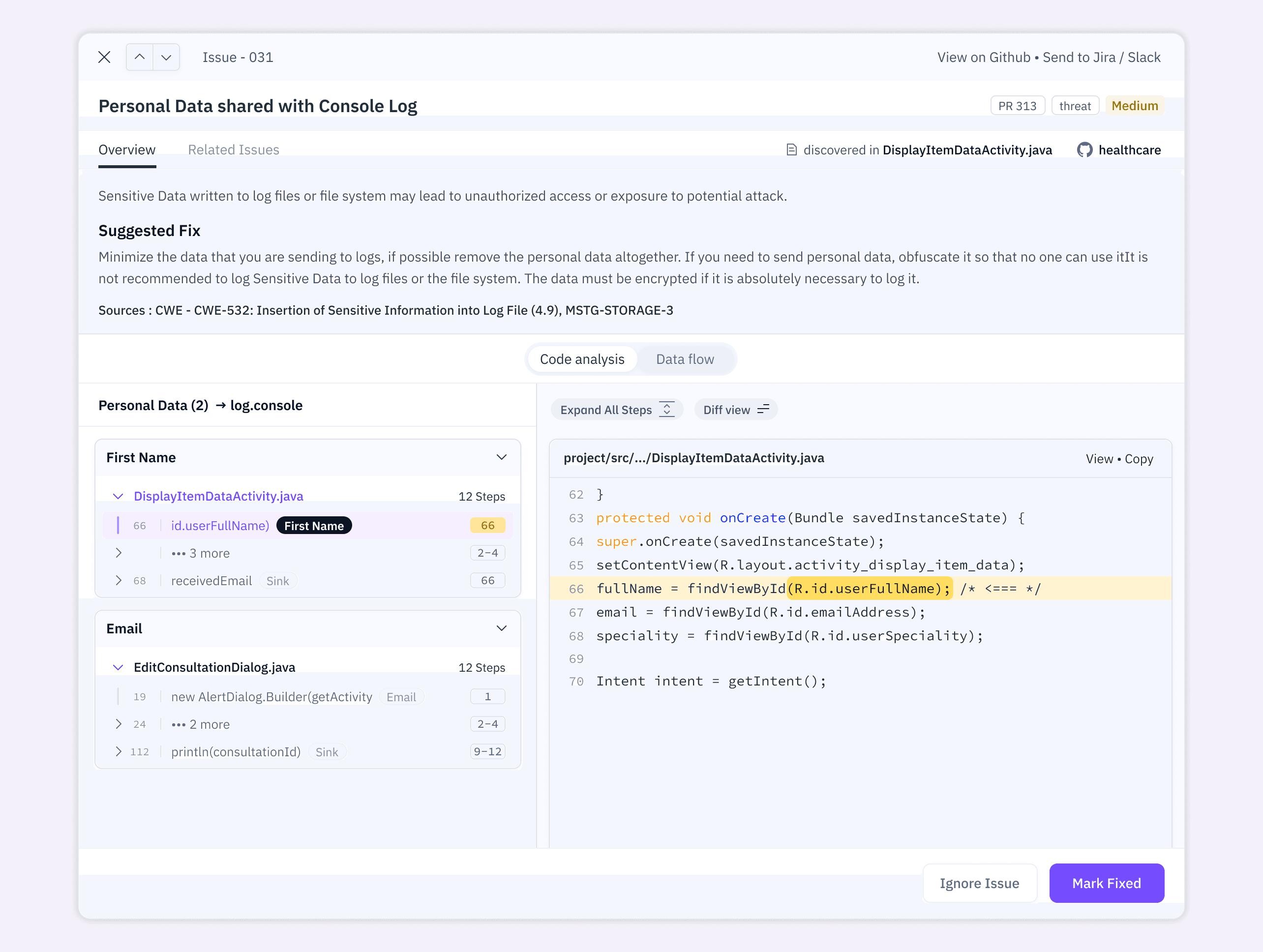
In a large codebase, a single variable can pass through dozens of files before reaching a sink. To manage cognitive load, I designed the Steps interaction as a breadcrumb trail for that journey.
The left panel lists the variable's lifecycle in order. The step count (e.g. "12 Steps") signals path complexity right away. Each step highlights only the critical operation, a variable assignment or a function call, so the engineer reads the logic before reading the syntax.
Clicking a step opens 5 to 10 lines of context on the right with the exact line marked. Labels like "First Name" and "Email" stay pinned above relevant lines so the engineer never loses track of what data they're following.
CONTEXTUAL REMEDIATION
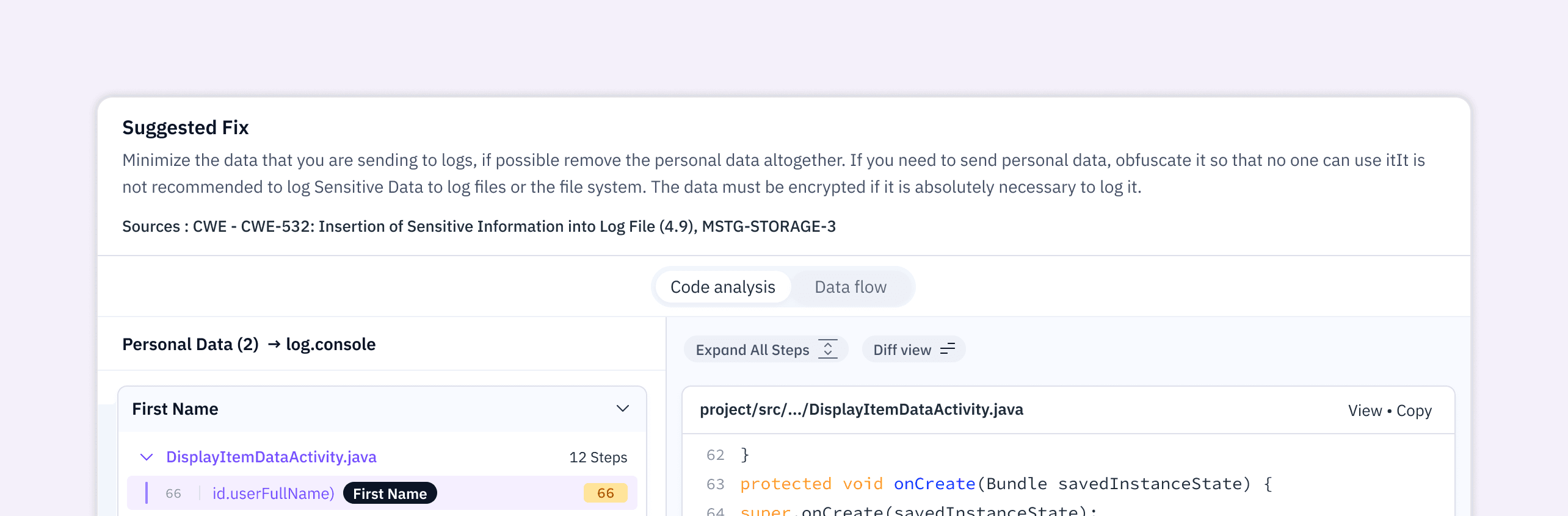
I placed the Suggested Fix above the steps on purpose. As the engineer traces a userFullName reaching a console.log, the fix is already in view. I structured fixes in a three-tier hierarchy:
Eliminate. Remove personal data from logs entirely.
Transform. Obfuscate the data so it's unusable by unauthorized parties.
Harden. Encrypt if logging is unavoidable.
Each fix cites industry standards (CWE-532, MSTG-STORAGE-3) so the recommendation reads as credible, not prescriptive. "Ignore Issue" and "Mark Fixed" live in a persistent footer.
Dashboard for Dual Personas
I designed the dashboard as a shared source of truth, with two layers separating strategic view from tactical work.
THE EXECUTIVE PULSE (TOP)
The upper half holds governance metrics: ROPA completion, 30-day trends for new repos, issues and overdue assessments. A manager can pull a report without scrolling past the fold.
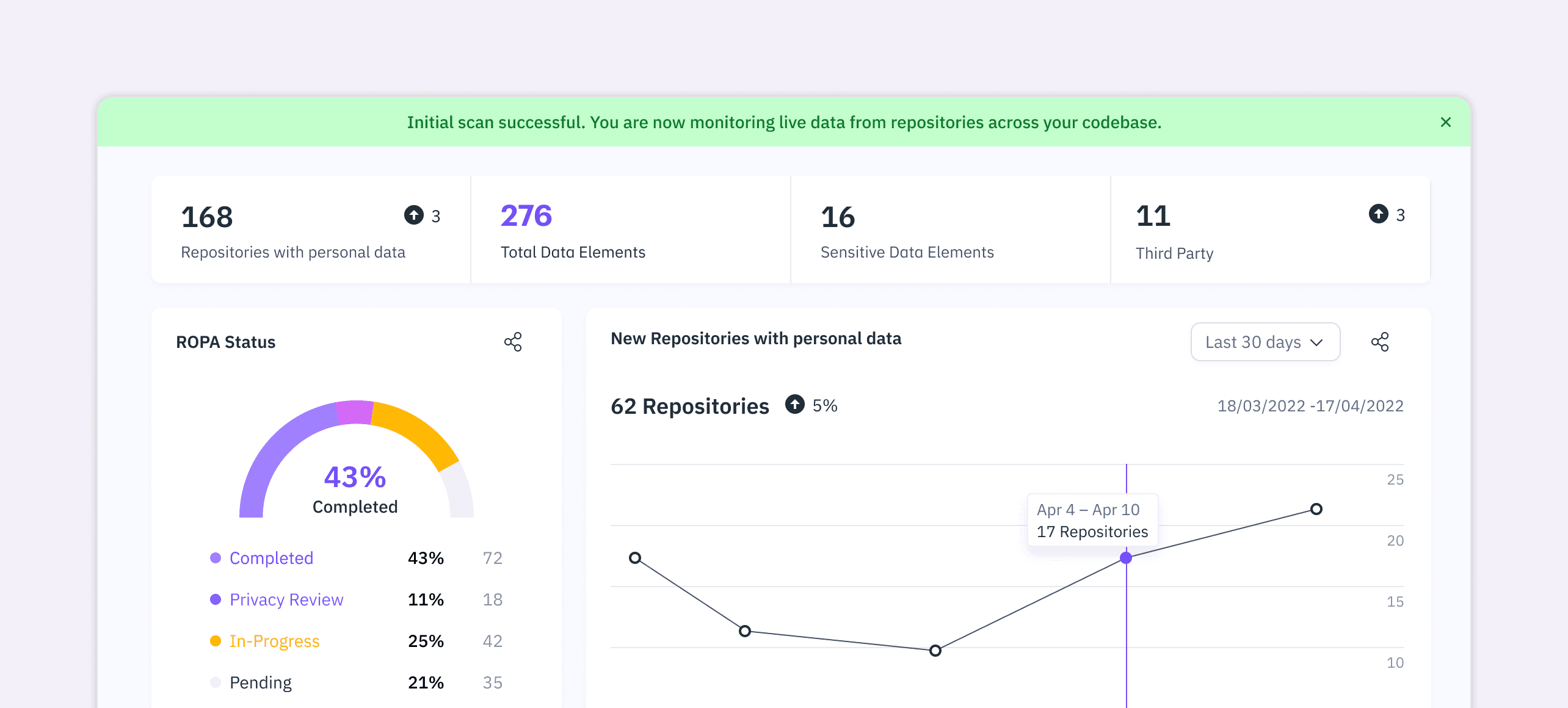
THE OPERATIONAL ENGINE (BELOW)
Scroll down and the interface shifts to a developer workspace: a scan table with live status, an active issue feed and "View Details" links that jump straight into code analysis.
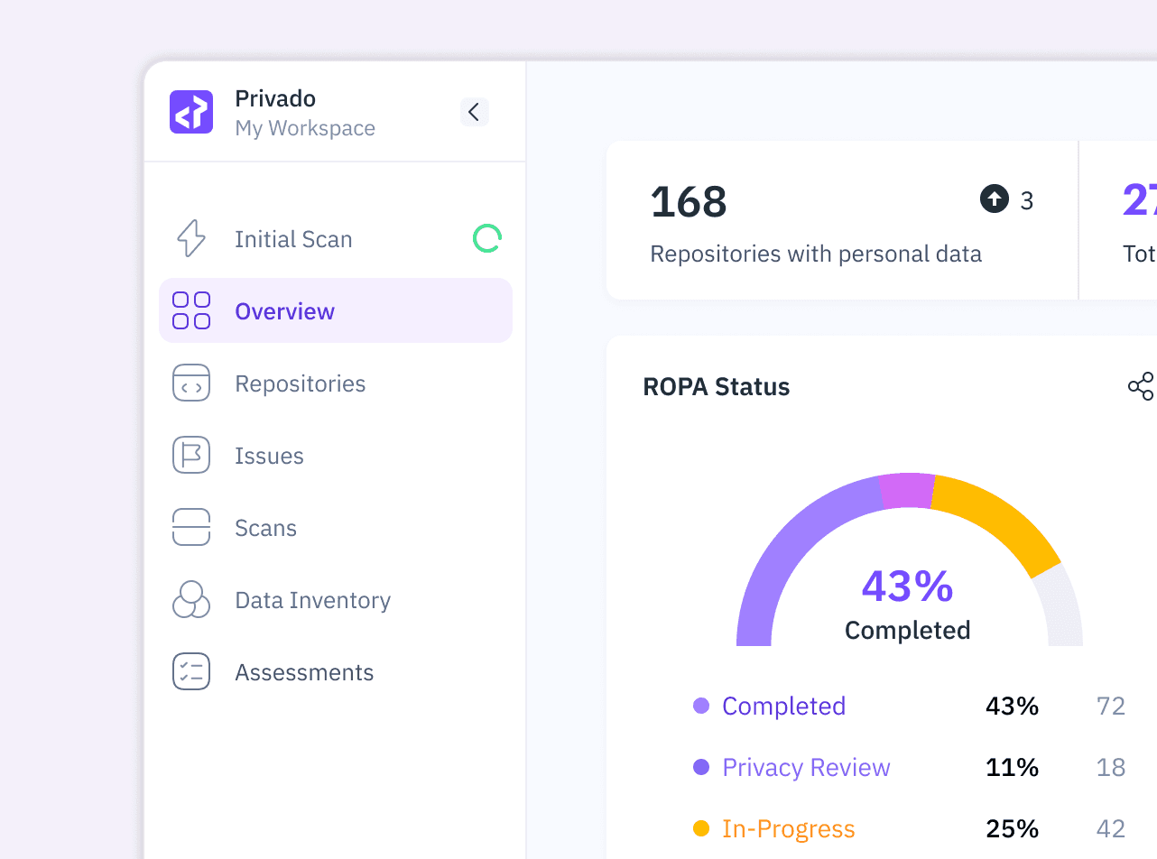
THE SIDEBAR AS BRIDGE
A persistent left nav keeps both personas in the same app. A manager lives in Overview or Data Inventory. A developer lives in Issues or Scans. A global "Initial Scan Active" banner tells both sides where they are, the manager knows data is still populating, the developer knows when results land.
Multi-Filter & Group By Logic
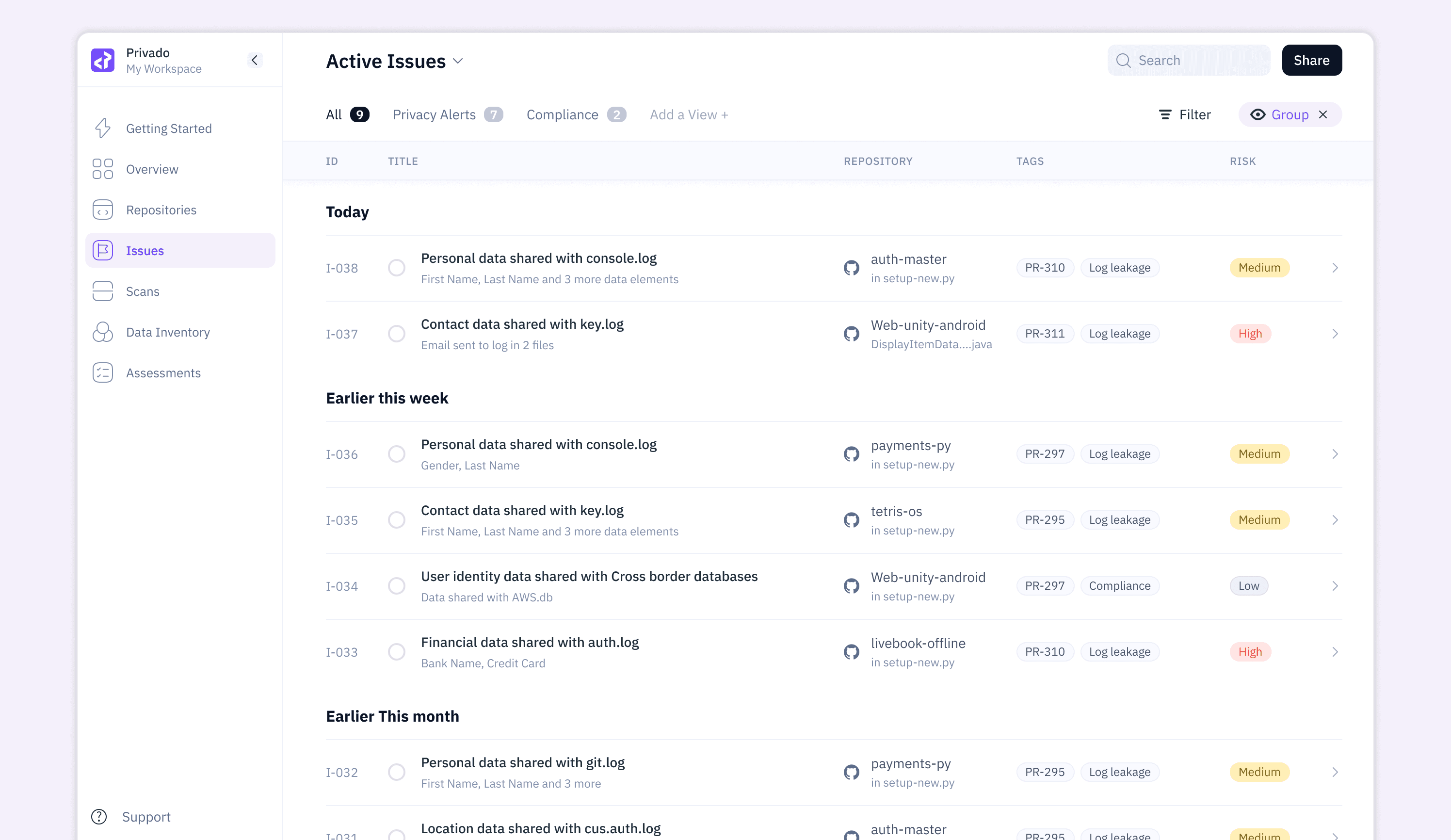
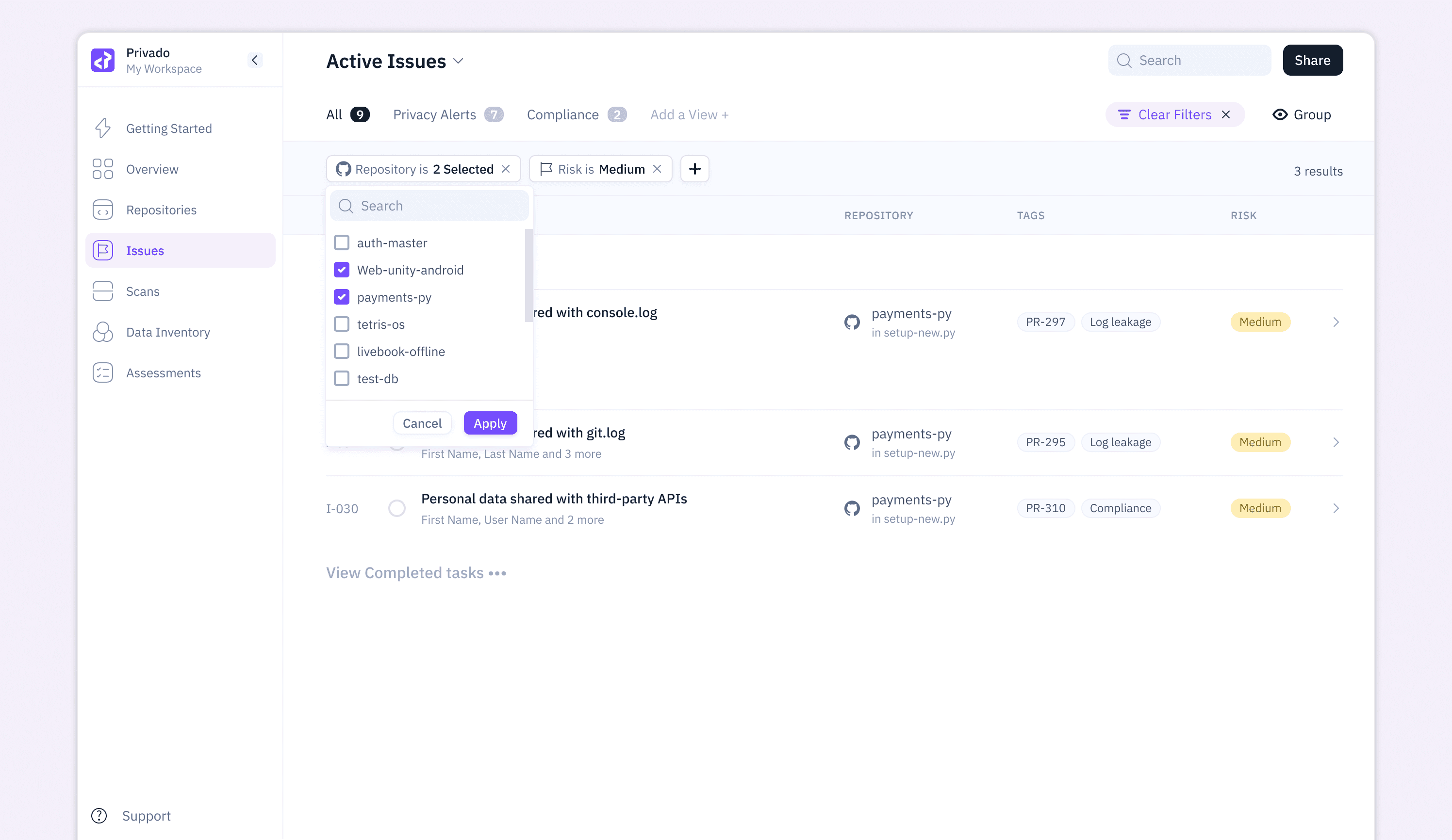
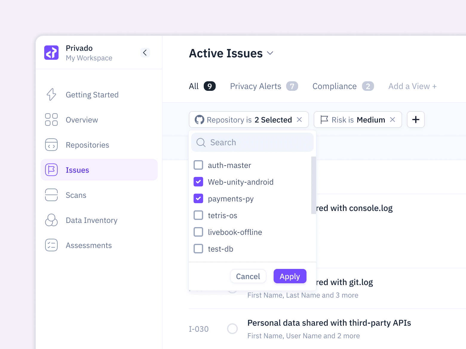
The issues list needed to support two distinct workflows: a developer clearing high-risk items in a sprint, and a lead engineer identifying which repository is the "leakiest."
I designed the Group By control to toggle between three dimensions — Time (recency: "Today," "Earlier this week"), Risk (severity: High, Medium, Low), and Repository (location). Combined with multi-select filters (e.g., "Repository is payments-py + Risk is Medium"), this turns a flat compliance list into a multi-dimensional triage tool.
Every row retains its full context — repository name, file path, PR number, issue type tag — regardless of grouping. The engineer switching between views never loses orientation.
Engineering Collaboration
I worked closely with the Software Engineers from day one. Privado scans real code, so design choices had direct costs in build time.
I brought open questions, they brought constraints in weekly syncs. Most decisions came out of those meetings, not out of my Figma file.
My approach was to sketch flows before pixels. Early wireframes caught feasibility problems while they were still cheap to fix.
The Steps interaction is one example. It needed information the scanner didn't yet produce, so we split the design into a v1 that worked with what existed and a v2 we planned together for later.
I built the design system alongside the build. Each component shipped with spacing, states and behaviour documented in Figma dev mode. Engineers grabbed tokens directly, which cut handoff questions to almost zero.
The persistent footer for "Mark Fixed" was something we discussed internally. A fixed footer would have eaten into long code traces, so we shrank its height and moved the code panel up to recover the space.
By the end, engineers were flagging edge cases I hadn't considered, early and unprompted. That's the feedback loop I wanted from the start.
Summary
The redesigned onboarding, data flow and issue tracking system turned Privado from a compliance reporting tool into a developer-native privacy platform. Every design decision was anchored in code-level evidence and progressive disclosure, which closed the gap between two personas that usually work in silos.
The onboarding's three entry points removed the adoption wall typical of enterprise security tools. The Steps interaction turned a tangled forensic trace into a guided walkthrough. The dual-layered dashboard gave both personas a shared home without forcing either to compromise.
80%
Onboarding completion rate
36%
Developer issue resolution improved by
8000+
Sensitive data flow issues detected
$14M
Series A round raised
Mahaveer took on the challenge of bridging two very different user worlds, compliance and engineering, and delivered an interface that both teams actually wanted to use. His onboarding flow and data flow visualizations became central to how we demonstrated Privado's value to early customers.
Prashant Mahajan
CTO, Privado